Monday, September 6, 2010

Term1 - Finally scanned those layouts

Well, it only took me another 3 terms to finally scan these. These were the actual assignments - mostly just perspective work. I posted each of them in 3 stages: the rough thumbnails, the reworked rough after blowing up the original thumbnail, and finally the cleanup.

At the very least, I learned a lot about line quality. We were told not to use any rulers during the cleanup stage.

1 Point


2 Point


3 Point (don't ask about the big smiley sphere - I don't really know either)


4 Point/ Distorted (Didn't have to take it past the rough stage)
Random doodle I found on one of the layouts. It's a saaad cactus.

Sunday, September 5, 2010

Term4 - LifeDrawing - Crits

Well, these are the lifedrawings that I used for my final critique. I'd like to think that I have come a long way this year.

My teacher really disliked this page - a believer of enclosed figures. Still, I really like it, and believe that I adequately described the main forces despite using few lines. Lots of room for improvement though - which is fantastic. Though it says 1min, I'm pretty sure all but the bottom left are 30 second poses.

I'd like to refine this technique further, and be able to describe entire figures using just the flow. I think it gives a stronger sense of dynamics than starting with the torso or head. We'll have to see whether this technique amounts to anything down the line. I am really interested to see how far I can take it.

Getting better at perspective. I really have to start pushing the limit though.

Yay! Faces that actually carry a semblance of the model! I like the bottom pose's arm too.


...Bleh. I can either have partial drawings with lots of life, or drawings that are worked further and are hollow because of it. These are the latter. Have to make sketching a habit again.

Term4 - LifeDrawing

Some lifeDrawings from term 4 that were not used in the critique.


The one in the bottom left is particularly bad, but I really like how the arm looks.
Experimenting with another way of gesturing. Instead of always beginning at the head or torso, I might start with an arm or leg - rather than using solid shapes, I'm attempting to ride the flow through the form. Doesn't always work, but that means I can improve upon it.

Just having fun with this stuff. Most of the poses on this page have lots of problems with them. Added a head because this one turned out okay - I usually have a lot of trouble defining the face without making it overly cartoony.


Like the bottom one despite the issue with the knee's foreshortening.

Some portraits of classmates. This one's Frida.
Steve. My portraits are still weak. Still can't recognize which features to push and which to subdue.

Wednesday, August 18, 2010

Term4 - Short - Re-storyboarded


Not up to date with the finished shots, but it gives a better look at the story all the same - this is assuming I posted my first *really* rough boards.

Illustrations 1

I have been attempting to learn how to colour via photoshop. Wanted to post them to show my progress down the line.

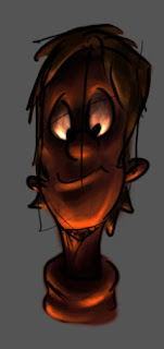
One of my very first attempts.
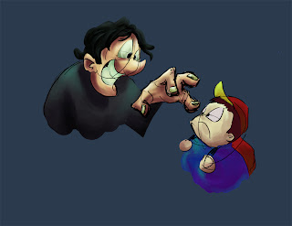
I... don't really know. Drew the creepy guy and a classmate suggested the kid. Or maybe it was me. Anyway, I had fun colouring the pretty picture, and I learned a lot, so that's all that matters.

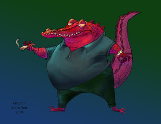
I asked if I could use the lineart of one of my classmate's (Steve Neu) drawings to practice on.

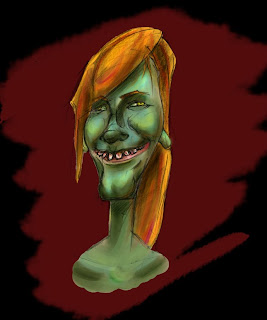
I have also been practicing caricatures, so I figured I may as well colour it as well- these are two attempts at another classmate. Still having a lot of trouble discovering which features to exaggerate and which ones to subdue - but I am improving.

[EDIT]: I was looking through my old files from school, and found this.

I was sketching during a part-time digital concept class I was taking while at Vanarts, and teacher Stephen Pearce happened upon it. He amped the drawing up. A lot. Since it would just be sitting in some folder otherwise, I wanted to share it - for inspiration at the very least. He's damn good.

Saturday, June 19, 2010

Term4 - Short - s09 Horse-> House -> Turtle2

Yeah, it's been mentioned that my titles might be a bit superfluous. I will try to shorten them from now on (this post marking the last)


Anyway, this is the key for the 'house' horse


And this is the suggestion that Mark made- though the flow was working, he mentioned that the key I made is from a slightly downwards angle, and does nothing for the illusion that the horse is growing. This picture is the revision he threw down. The difference in the impact is staggering.


He also mentioned that the choice I used for the shrinking motion was backwards; for the horse to be sucked down instead would add emphasis to the knight's movement that followed. I originally wanted to do that, but could not solve the problem of the horse's legs simply shifting along the ground. This is another picture that Mark did that solved that problem.

Friday, June 18, 2010

Term4 - Short - s09 Horse-> House -> Turtle

Scene 9 WIP for the short.


Breakdown of the second half. Fixed the POA busted frames.


I added some extra movement to the beginning in an attempt to be more realistic. It worked, but it detracted from the animation... a lot. And it made the action too slow.

Also realized that the shoulder sphere left the POA a bunch of times.


First rough

Saturday, June 12, 2010

Term3 - LifeDrawing - Crits - Life sketches

To be blunt, I did it wrong. The focus was supposed to be on character and story. Almost all of these lack that. I'm not very happy with them, but I do like the face sheet I threw on the end - at least I'm definitely improving in that area.

I'm still having trouble not simply copying what I see.