![[David Bernath Draws Stuff]](https://blogger.googleusercontent.com/img/b/R29vZ2xl/AVvXsEjA4Cp_2R4PqeZFbzypEu4pA5A8mq1I99ICtmkLJtDfCY02Ken4oP-YCKg4gefEVQ9CPQQAzrd1oPc0jBY9rULKraecdXm1Rl7o_lYjMWqWCD99KlL30j4FB2s1ONunG6aqii69n0GJxm87/s1600/Banner01b.png)
Wednesday, August 18, 2010
Term4 - Short - Re-storyboarded
Not up to date with the finished shots, but it gives a better look at the story all the same - this is assuming I posted my first *really* rough boards.

Illustrations 1
I have been attempting to learn how to colour via photoshop. Wanted to post them to show my progress down the line.
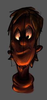 One of my very first attempts.
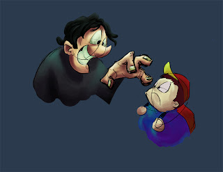 I... don't really know. Drew the creepy guy and a classmate suggested the kid. Or maybe it was me. Anyway, I had fun colouring the pretty picture, and I learned a lot, so that's all that matters.
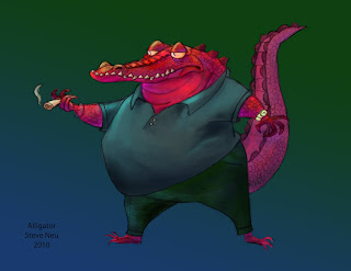
I asked if I could use the lineart of one of my classmate's (Steve Neu) drawings to practice on.

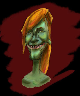 I have also been practicing caricatures, so I figured I may as well colour it as well- these are two attempts at another classmate. Still having a lot of trouble discovering which features to exaggerate and which ones to subdue - but I am improving.
[EDIT]: I was looking through my old files from school, and found this.

I was sketching during a part-time digital concept class I was taking while at Vanarts, and teacher Stephen Pearce happened upon it. He amped the drawing up. A lot. Since it would just be sitting in some folder otherwise, I wanted to share it - for inspiration at the very least. He's damn good.
 One of my very first attempts.
 I... don't really know. Drew the creepy guy and a classmate suggested the kid. Or maybe it was me. Anyway, I had fun colouring the pretty picture, and I learned a lot, so that's all that matters.
I asked if I could use the lineart of one of my classmate's (Steve Neu) drawings to practice on.

 I have also been practicing caricatures, so I figured I may as well colour it as well- these are two attempts at another classmate. Still having a lot of trouble discovering which features to exaggerate and which ones to subdue - but I am improving.
[EDIT]: I was looking through my old files from school, and found this.

I was sketching during a part-time digital concept class I was taking while at Vanarts, and teacher Stephen Pearce happened upon it. He amped the drawing up. A lot. Since it would just be sitting in some folder otherwise, I wanted to share it - for inspiration at the very least. He's damn good.
Saturday, June 19, 2010
Term4 - Short - s09 Horse-> House -> Turtle2
Yeah, it's been mentioned that my titles might be a bit superfluous. I will try to shorten them from now on (this post marking the last)

Anyway, this is the key for the 'house' horse

And this is the suggestion that Mark made- though the flow was working, he mentioned that the key I made is from a slightly downwards angle, and does nothing for the illusion that the horse is growing. This picture is the revision he threw down. The difference in the impact is staggering.

He also mentioned that the choice I used for the shrinking motion was backwards; for the horse to be sucked down instead would add emphasis to the knight's movement that followed. I originally wanted to do that, but could not solve the problem of the horse's legs simply shifting along the ground. This is another picture that Mark did that solved that problem.

Anyway, this is the key for the 'house' horse

And this is the suggestion that Mark made- though the flow was working, he mentioned that the key I made is from a slightly downwards angle, and does nothing for the illusion that the horse is growing. This picture is the revision he threw down. The difference in the impact is staggering.

He also mentioned that the choice I used for the shrinking motion was backwards; for the horse to be sucked down instead would add emphasis to the knight's movement that followed. I originally wanted to do that, but could not solve the problem of the horse's legs simply shifting along the ground. This is another picture that Mark did that solved that problem.
Friday, June 18, 2010
Term4 - Short - s09 Horse-> House -> Turtle
Scene 9 WIP for the short.
Breakdown of the second half. Fixed the POA busted frames.
I added some extra movement to the beginning in an attempt to be more realistic. It worked, but it detracted from the animation... a lot. And it made the action too slow.
Also realized that the shoulder sphere left the POA a bunch of times.
First rough
Breakdown of the second half. Fixed the POA busted frames.
I added some extra movement to the beginning in an attempt to be more realistic. It worked, but it detracted from the animation... a lot. And it made the action too slow.
Also realized that the shoulder sphere left the POA a bunch of times.
First rough
Saturday, June 12, 2010
Term3 - LifeDrawing - Crits - Life sketches
To be blunt, I did it wrong. The focus was supposed to be on character and story. Almost all of these lack that. I'm not very happy with them, but I do like the face sheet I threw on the end - at least I'm definitely improving in that area.
I'm still having trouble not simply copying what I see.


I'm still having trouble not simply copying what I see.


Term3 - LifeDrawing - Crits
Clint's notes on my lifedrawing this term. (Includes notes on the sketches in the post above)

He also mentioned that strong action takes priority over everything, and I neglected that on the poses with drapery. Shading also takes a back seat.


He also mentioned that strong action takes priority over everything, and I neglected that on the poses with drapery. Shading also takes a back seat.


Friday, June 11, 2010


Term3 - LifeDrawing - some anatomy


 We were supposed to take a greek mythology based character and create a statue-like picture of them. That it should be so sculpted that it could serve as a base plan. I am really not at all happy with the result - but that is what a lack of effort produces. I don't believe that this is an adequate example of where I am right now, but I'd like to post it none-the-less, if only to serve as a reminder to me.
 Notes regarding the statue pic from Clint.
Term3 - Animation - Critique (Dialogue & Panta)
The final dialogue I used for the critique.
The biggest points mentioned during it were: that I forgot that movement flows from the hips (I was originating it from the torso), and that I need to learn when to stop moving the character. They did say that the mouth movements were looking good though. I still need a LOT of practice on subtle animation. In short, I don't do it. Though I'm trying to change that.
Quick modification of the quicktime file made by Dillen Brown (the Creative director of Pixar Canada!!!) when he came to our school. After a discussion of acting with the animation classes, he came around to our rooms and looked over some of our stuff!
His main point was to hold the final frame on 'darla'- he said I could get a lot more mileage out of that pose than I was using it for.
First run for my dialogue.
Again, not enough time to portray my acting choice on the later half. The head turn looks like he's snapping his neck.
A slightly revised version of the pantomime I chose. I would have liked to have had more time to work on this. Still too much movement with not enough time to register it.
Term3 - SVL - Short - Character research + development
 Someone said that my design looked a bit like the gentlemen's duel characters, so I drew them and slapped them onto the bottom left corner for good measure.
 The horse designs will probably ring a bell for most of you. Since I really had no idea how to approach the design for the horse, I looked around and found some interesting characters for inspiration - and direction. I normally don't work this way since your designs end up reflecting someone else's ideas, but I hit a bit of a wall by this point.
- looney tunes horse (from the opera episode with Elmer's lightning helmet)
- sleeping beauty - the prince's horse
- the no-naked horse
 Bottom left picture is drawn by Merly doodles (yes, that is an alias)
 I originally wanted a highly stylized, but otherwise stereotypical dragon - the top three are renditions of Breath of Fire's amazing designs. I ended up going off in my own direction - much my preference.
 I combined animal traits with the dragon concept, and ended up with an anteater-dragon and whale-dragon. The center image ended up looking like the starwars monster in Java's pitt - funny, but completely unintentional.
 Layouts for the original story that ended up never getting used.
Subscribe to:
Posts (Atom)